
florence rain
Everybody talks about the weather but nobody does anything about it.
- Mark Twain
Year to Date & Current Month
Click thumbnails for a larger image
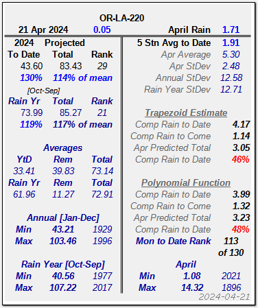
Current Year to Date numerical data with projections based on historical data since 1895.
On the left are Annual and Oct-Sept Rainy Season totals to date, an estimate for the whole period and the year's rank since 1895. Higher rankings are wetter. Below are annual averages and remaining Average - YtD. Below that are Historical and Rainy Season Min/Max and year.
On the right is the data date & rain, total to date, month average and Standard Deviations for the month, Year and Rain Year.
Below are two current month estimates based on the historical data. The Trapezoid Estimate uses a linear estimate based on the slope of the previous, current and next month averages. The Polynomial Function uses a 4th order polynomial to fit a curve through the prior two, current and next two months' averages. Current month to date rank based on the polynomial curve through the monthly averages.
At the bottom are the Min & Max years for the month.
Daily Rain
| 2021 | 2022 | 2023 | 2024 |
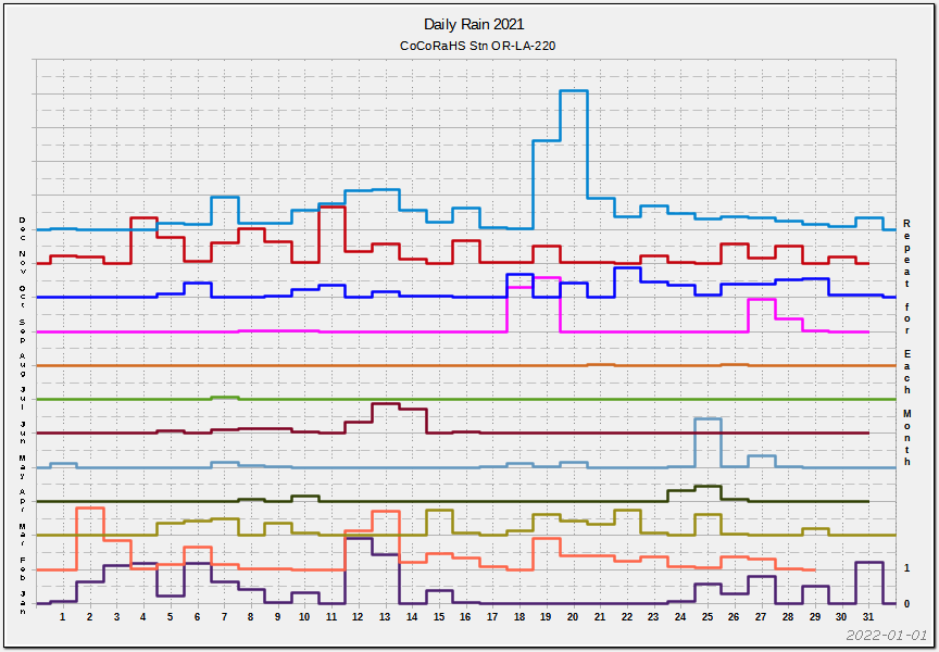
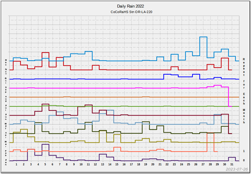


Daily rain @ CoCoRaHS Station OR-LA-220. Months are stacked and offset by one inch grid spacing. Solid grid lines are 1 inch and Dashed are 0.5 inch.
Monthly & Annual Average Rain
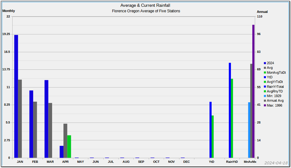
Monthly & Annual Average Rain, Current Month and Year to Date and Minimum, Average and Maximum annual rainfall since 1895. North Pacific coastal towns can be a bit damp at times.
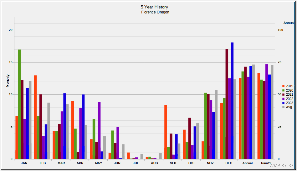
Five Year History by Month with Annual and Rain Year to Date
A very useful app for precipitation prognostication is Flowx. The free version is better than many paid apps evaluated. Using the app, you can decide the best time for walking the dog, marketing, hiking, flying, etc. The missus uses the free version and I, the Silver. It's a very polished app with a simple, but flexible interface. We were even able to use it to determine a forward berth on a cruise should be OK by looking at general wave patterns. Highly recommended.
Annual Rain Totals
A lie gets half way around the world before the truth has a chance to get its pants on.
- Winston Churchill
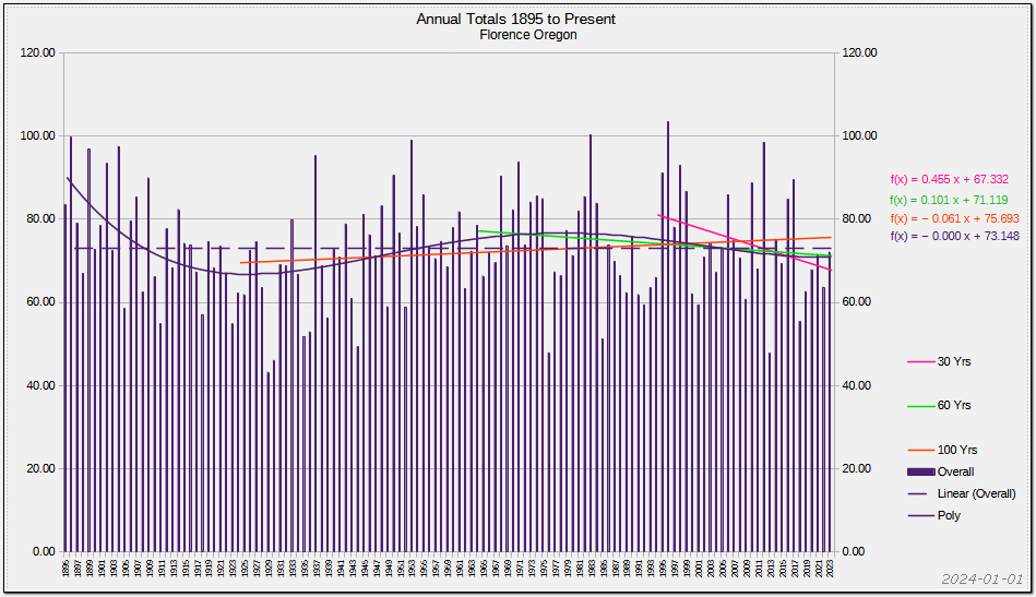
Annual Rain Totals and trend since 1895. Annual totals over the years with data† has a decreasing* trend, about 0.058in/yr. A few wet years, as occurred around 1900, could negate or reverse the trend.
OTOH, a polynomial function shows that rain is increasing for the last couple of decades. Data over a longer time frame would give higher reliability, unless the data is chaotic, in which case making predictions is a fools errand. And therein lies the danger of predicting the future based on infinitesimally short data sets.
OTOH, a polynomial function shows that rain is increasing for the last couple of decades. Data over a longer time frame would give higher reliability, unless the data is chaotic, in which case making predictions is a fools errand. And therein lies the danger of predicting the future based on infinitesimally short data sets.
By choosing the period over which the data is analyzed, rain is either decreasing or increasing. The 45 & 50 year values differ by a factor of 5. That, dear reader, is exactly how climate alarmists achieve the desired result: manipulate the data!
See Climategate: Ten Years Later
A little chicanery helps. Stephen Schneider — creator of the journal Climatic Change and one of the founding members of the UN’s Intergovernmental Panel on Climate Change (IPCC) — wrote in 1971 'It is found that even an increase by a factor of 8 in the amount of CO2, which is highly unlikely in the next several thousand years, will produce an increase in the surface temperature of less than 2°K.' then said in 1989 'We have to get some broad-based support, to capture the public’s imagination. That, of course, entails getting loads of media coverage. So we have to offer up scary scenarios, make simplified, dramatic statements, and make little mention of any doubts we might have. This “double ethical bind” which we frequently find ourselves in cannot be solved by any formula. Each of us has to decide what the right balance is between being effective and being honest. I hope that means being both.' [Emphasis added]
An excellent article on how wrong are climate alarmist dire predictions: Climate Change Fears Of Teen Activist Are Empirically Baseless
† data exists for ≈130 years of the past hundreds of millennia
* f(x) sign is reversed as data table is current to 1895. Graph is plotted in reverse data order
Volatility
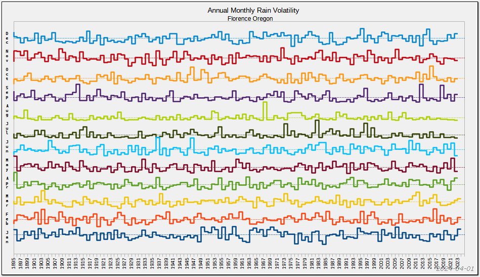

The graph shows rainfall by month from 1895 to present. There is no pattern or trend in year to year rainfall. The dotted lines are the data mean. It can be seen that rainfall may be below average for several years and then ping-pong above and below. Or an exceedingly wet month can occur after a year of below average rain as occurred in December 2016, presaging the 2nd wettest year in Florence's history.
Another way of looking at the same data is how much the data varies from average. The graph thin line shows the Min/Max range and the rectangle shows the Average ± StDev. All too frequently, alarmists make statements like "Rain has been below average for the past three years." While that may be true, given the chaotic precipitation, it's essentially meaningless.
Another way of looking at the same data is how much the data varies from average. The graph thin line shows the Min/Max range and the rectangle shows the Average ± StDev. All too frequently, alarmists make statements like "Rain has been below average for the past three years." While that may be true, given the chaotic precipitation, it's essentially meaningless.
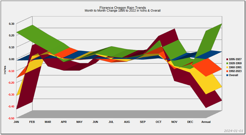
Historical Trends
“plus ça change, plus c'est la même chose”
- Jean-Baptiste Alphonse Karr
A great many bits are committed to climate change.
The climate has always changed.
The climate will always change.
The graph averages monthly year to year change from 1895 to present in four periods. The legend caption is the last year of the period. While the period volatility is quite pronounced, the overall volatility is remarkably constant, up a very little, down a very little over a century and a quarter.

The graph shows Tmin, Tmean and Tmax for Florence. Maximum temperature trend is down by three one thousandths of one degree Fahrenheit per year over the past century and a quarter. The minimum temperature rises by the same amount. The mean temperature decreases by 20 MILLIONTHS per year. If one looks at the period beginning around 1980, i.e. the start of the global warming hysteria, temperatures are rising. Around the time global warming morphed into
climate change, temperatures had fallen considerably. Right on cue, the mid-teens rose again and are now again falling.
City temperatures, where sit most universities and government office, are rising due to land use changes. Not so much in the country. A perfect example is the time the flowers bloom at Windsor Castle and Buckingham Palace. Both are about the same latitude, Buckingham Palace being about 1¼ miles north and 16½ miles east. Spring flowers bloom about a month earlier at Windsor than Buckingham. Same department maintains the gardens. The reason? Buckingham is in the city while Windsor nestles in the country.
City temperatures, where sit most universities and government office, are rising due to land use changes. Not so much in the country. A perfect example is the time the flowers bloom at Windsor Castle and Buckingham Palace. Both are about the same latitude, Buckingham Palace being about 1¼ miles north and 16½ miles east. Spring flowers bloom about a month earlier at Windsor than Buckingham. Same department maintains the gardens. The reason? Buckingham is in the city while Windsor nestles in the country.
Prognostication
“...avoid prophesying beforehand because it is much better to prophesy after the event has already taken place”
- Winston Churchill
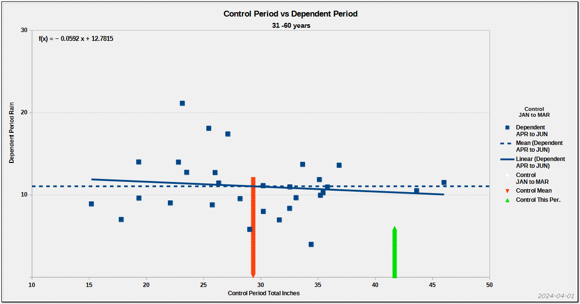
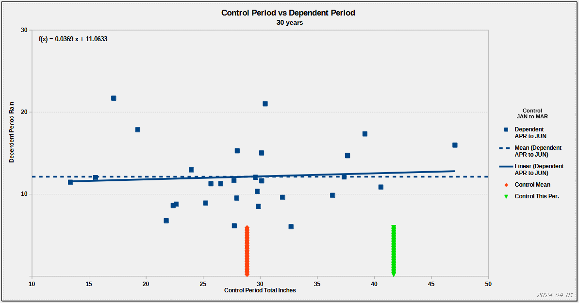
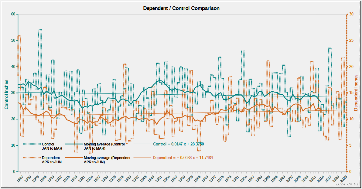
| Overall | 31-60 years | Last 30 yrs | Comparison |

A frequent topic of conversation is whether it's a wet or dry year and the likelihood of the current trend continuing.
The left 3 graphs show the grouping of a control period and how it correlates with another period and a trend. A Positive slope indicates the control period presages a similar dependent period, a Negative slope the inverse. The more tightly grouped the higher the correlation. Widely scattered points indicate a chaotic relationship.
The left graph is the total data set from 1895 to present, the second graph is the the period 31 to 60 years ago and the third is the last 30 years. Choosing other periods changes correlation factors. However, they are only different, not better. The right graph shows the Dependent and Control in a linear format. The wavy horizontal lines are an 11 year (≈Solar Cycle) moving average of the Dependent and Control values. ENSO (El Niño Southern Oscillation) is a contributing factor to North Pacific weather. ENSO has an indeterminate period of between two and seven years which when combined with solar and other factors makes predictions highly suspect. The thin solid lines are the historical trends for the control and dependent periods. Depending on the chosen periods the lines may be parallel, convergent or divergent. 2023 had the driest May to August since records began in 1895, predicting a very wet September. Sept 1, 2023 had 0.25 inches, more than May to August 2023 combined. May to August 2022 total was 14.17 inches and the third wettest May-Aug in history.
Note the moving average lines often do not parallel one another, indicating cyclical conditions. Typically there are close and divergent periods, giving lie to the unidirectional climate change fantasy. Over a century and a quarter, trends are in the thousandths of an inch per year or a few tenths of an inch per century!
In Other Words, your guess is as good as mine.
'There are three kinds of lies: lies, damned lies, and statistics.' - Benjamin Disraeli
DISCLAIMER: Flaws: Data is annualized and compartmentalized into months. There may be others.
Data from Oregon State and Community Collaborative Rain, Hail & Snow Network
DISCLAIMER: Flaws: Data is annualized and compartmentalized into months. There may be others.
Data from Oregon State and Community Collaborative Rain, Hail & Snow Network